The Blacklist (Season 1) | On-Air Promotion Brand Package
Art Direction, Concept Development, Design & Animation
In giving this show a proper introduction, the task of developing a visual brand proved to be fluid and ever-changing. From a global perspective, it was impressive to see the diversity in the marketing campaign. From the On-Air perspective, we wanted to make sure that the visual language and tone worked in concert with every other instance.
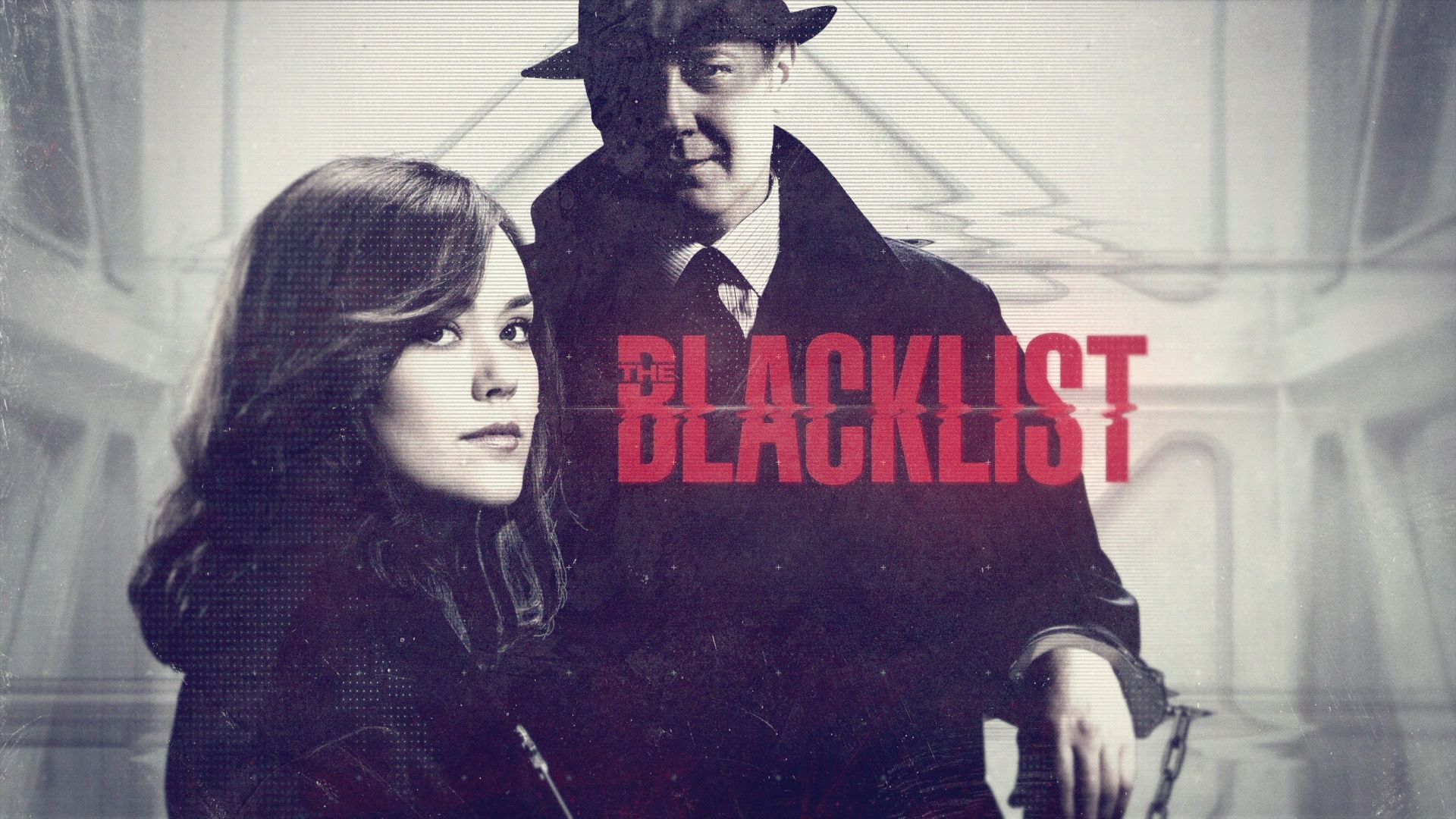
As we began this endeavor, we set out to define the show through its visual icons and introduce James Spader’s iconoclastic Red Reddington.
CREDITS
Vice-President On-Air Graphics: Brad Gensurowsky
Creative Director: Charles Beckman
Art Direction, Concept Development & Design: Grant Okita
Producer/Editor: Steven Wagner
Producer/Editor: Steven Wagner
Compositing & Animation: Grant Okita
This project was produced at NBCUniversal.
Design Process
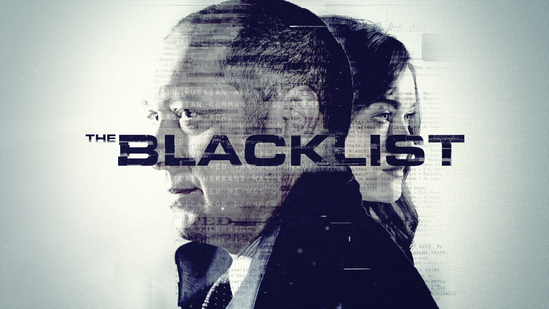
Pulling through imagery of “the List” created a dialogue about Red’s infamous background and his mysterious dealings... clues that defined Red by his list of dubious associates that became a resume of sorts.
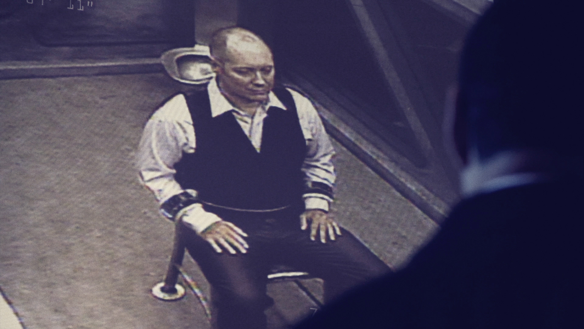
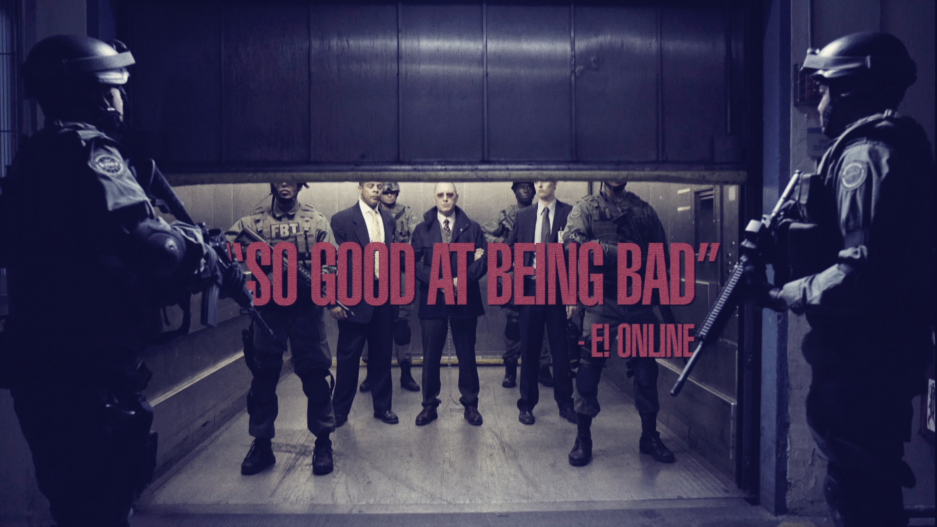
The high security holding cell became an interesting focus.
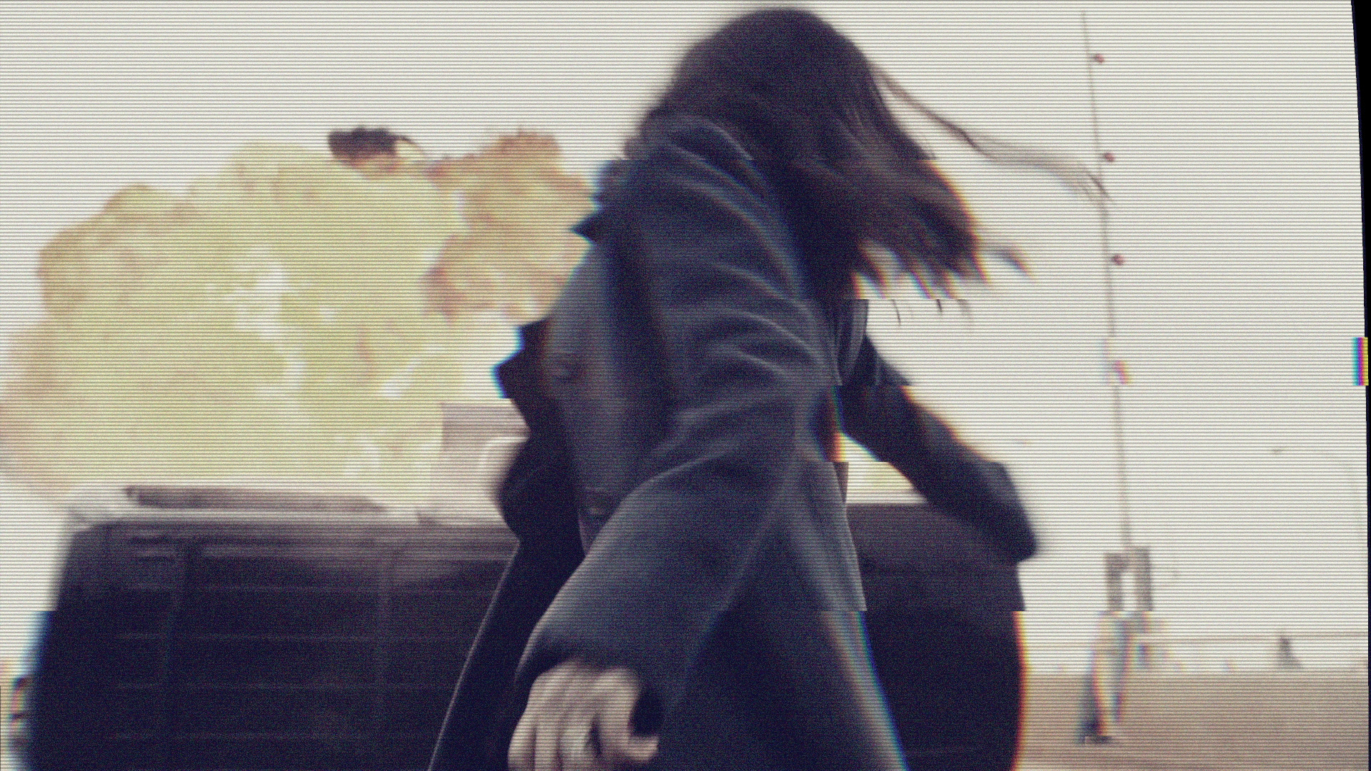
Adding the presence of Agent Elizabeth Keen (Megan Boone) also arose as a viable direction.
Adding the presence of Agent Elizabeth Keen (Megan Boone) also arose as a viable direction.
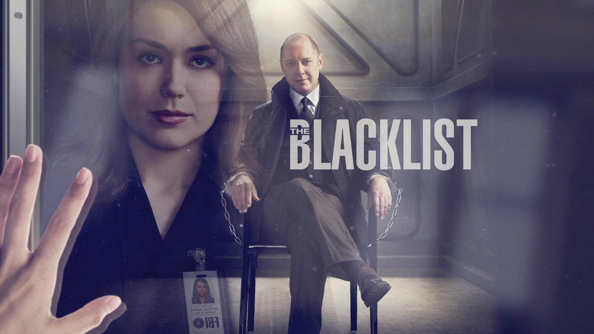
The security cell evolved, focusing on the digitally distorted monitors through which FBI analysts carefully monitored Red’s every move. By design, the image of Red is high contrast and well defined only to be juxtaposed with the distortion as a nod to his questionable, true intentions.
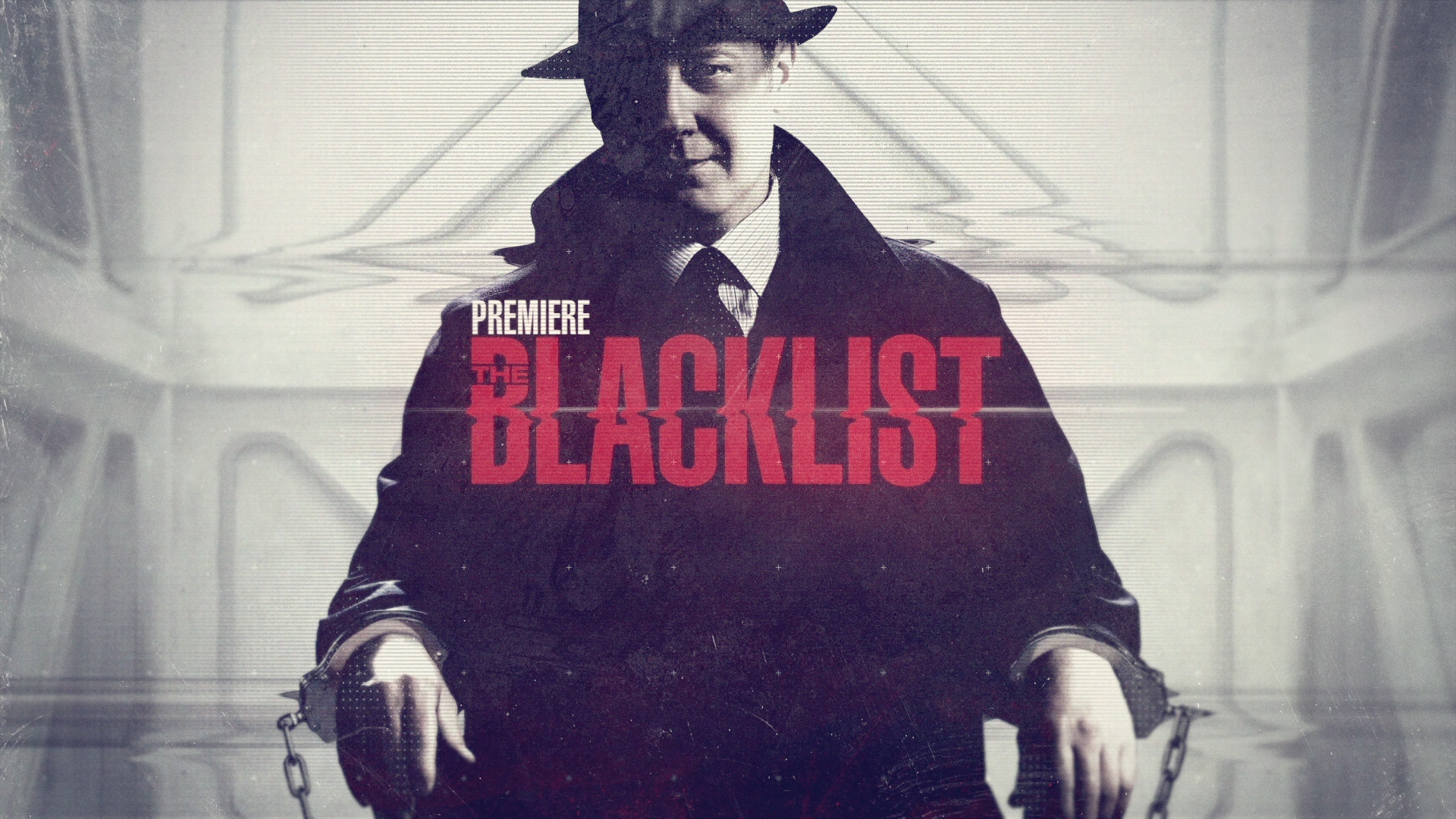
The colors helped to set the tone with the stark contrasting of black and white, we naturally had to incorporate red as well, adding so much to the tension and energy of the show.
Final Concept Development, Design, Animation
With a story that takes quick turns and always keeps you at the edge of your seat, the branding needs had to adapt to these shifts as well. The evolution of the visual branding followed the pacing of the show while helping to set the tone for what was next.