
The Blacklist (Season 2 & 3) | On-Air Promotion Brand Package
Concept Development, Design & Animation
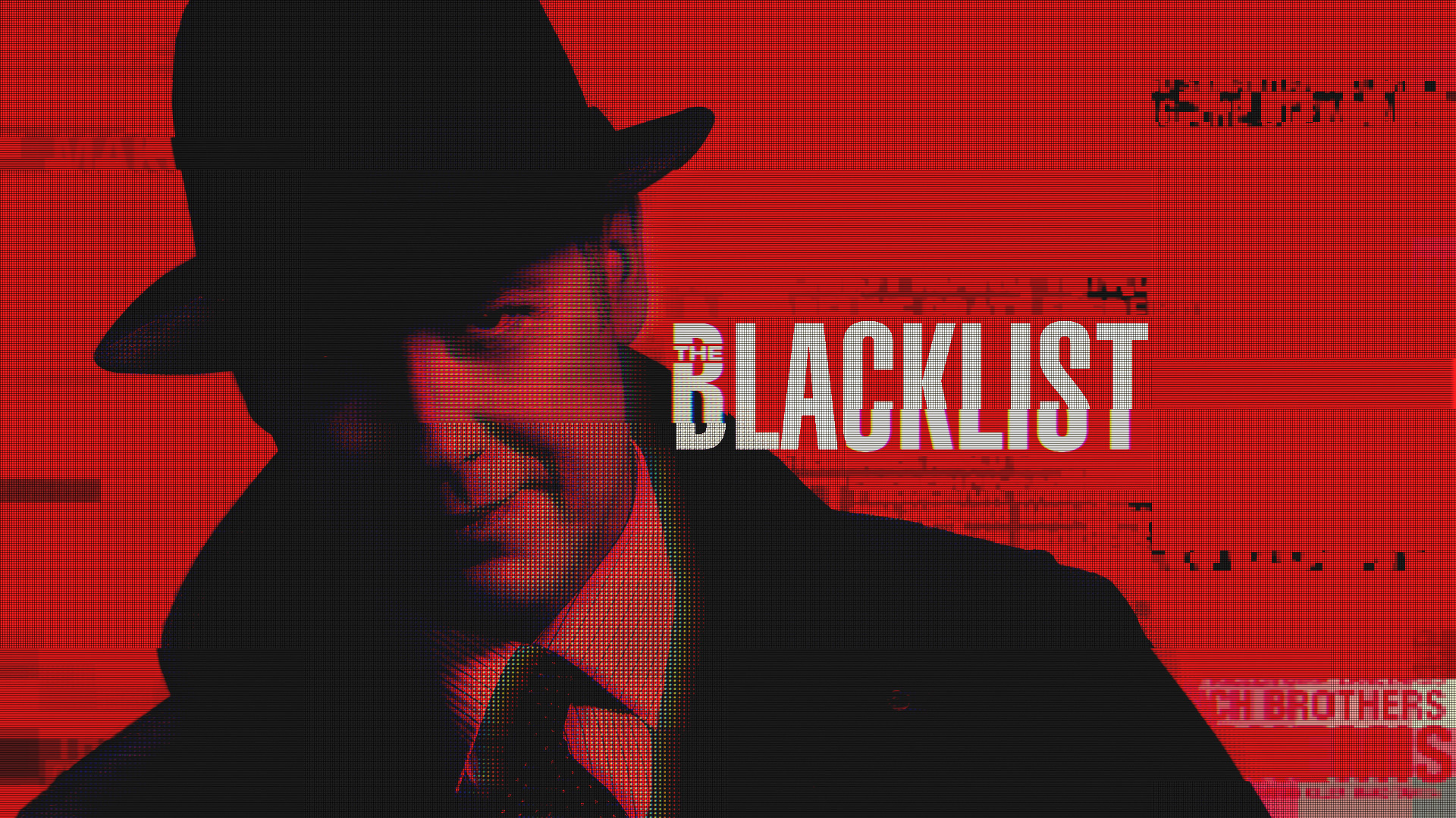
In developing the brand for the show, keeping with a lot of the same themes from the first season was important. We wanted to cultivate the established brand equity and success. In doing so, the design language was elevated and refined with more detail. The messaging was also directed to be more impactful with high contrast images that spoke to Red's bad-ass approach and demeanor.
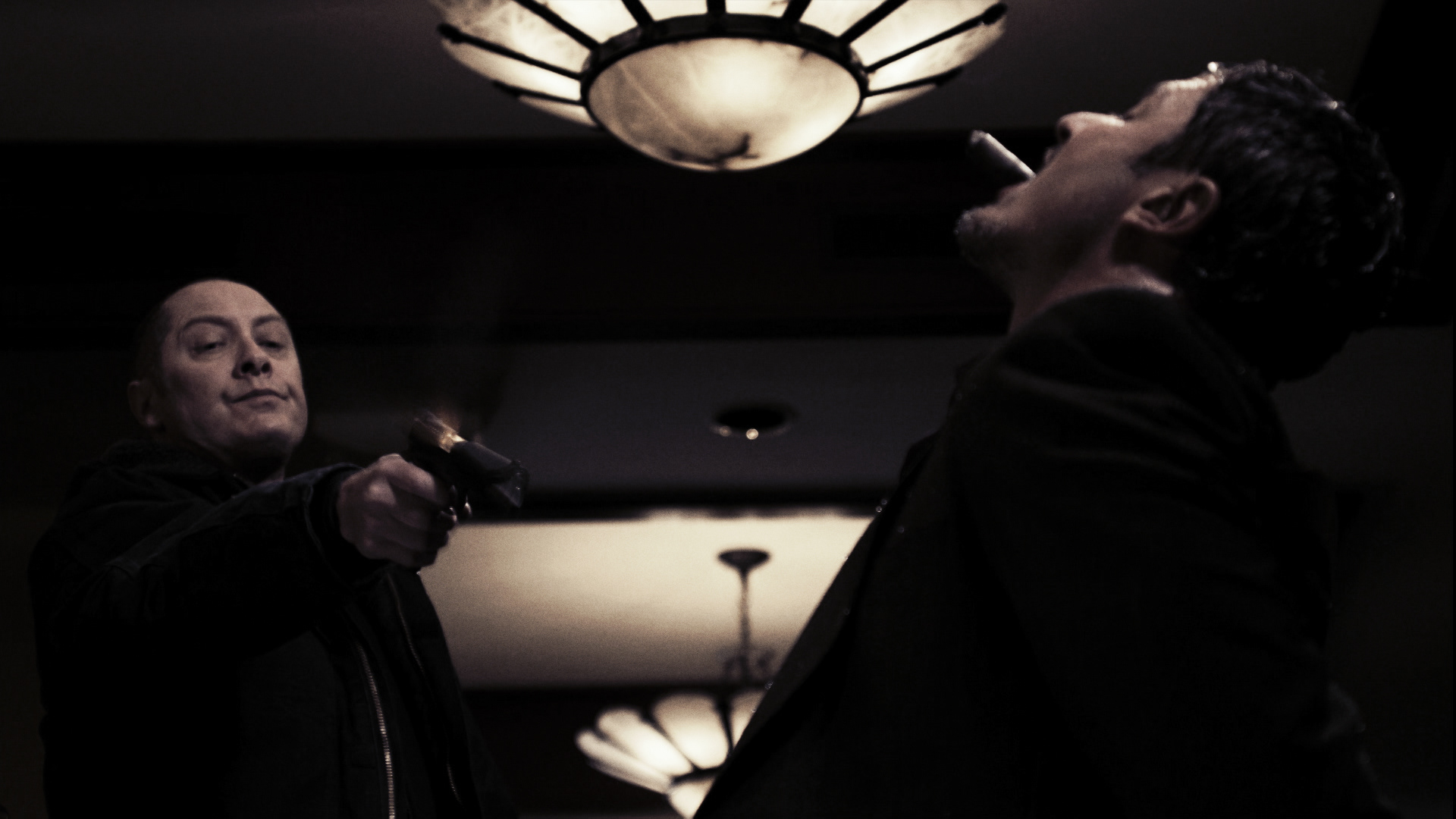
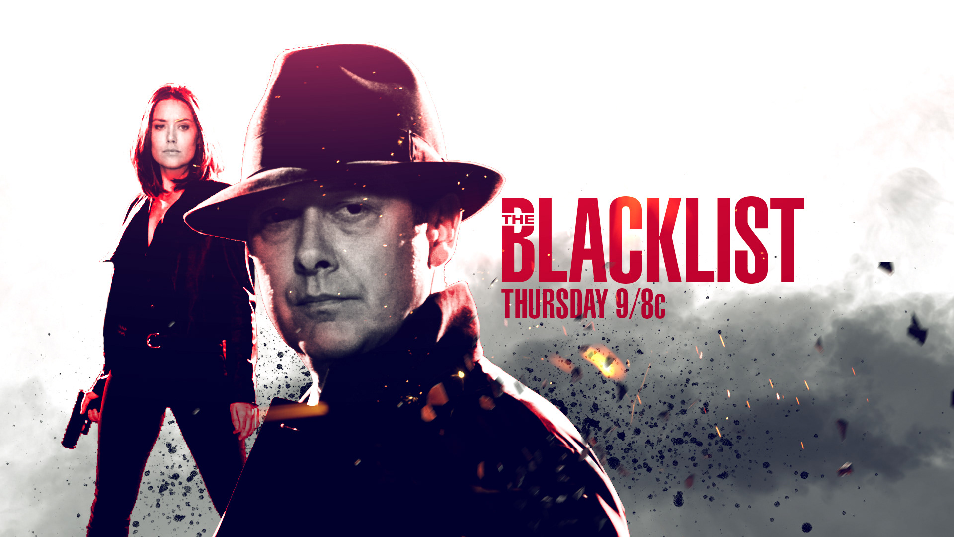
Season 2 | Brand Design Montage
Season 2 | On-Air Promo :15 "Stay Off His List"
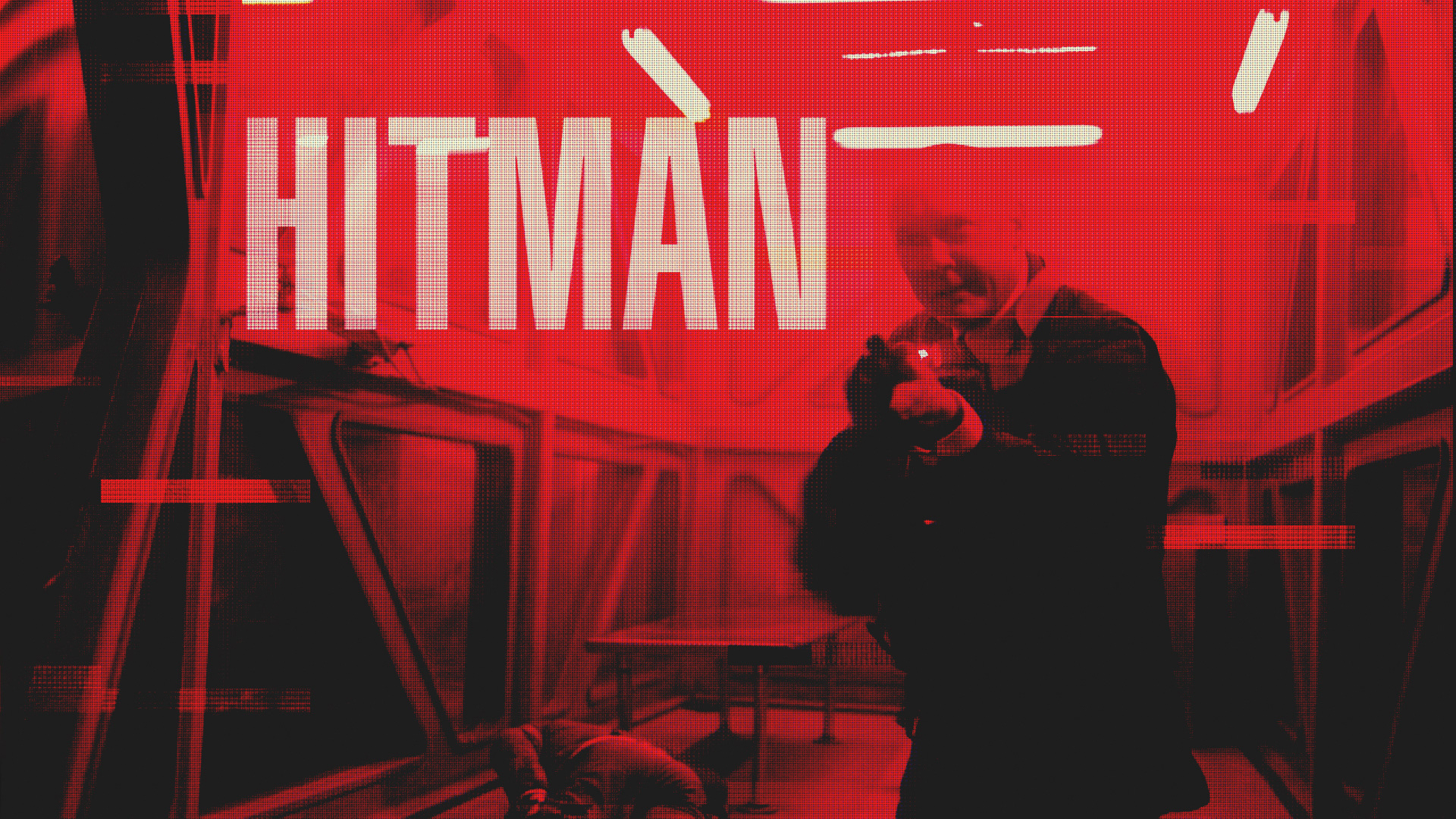
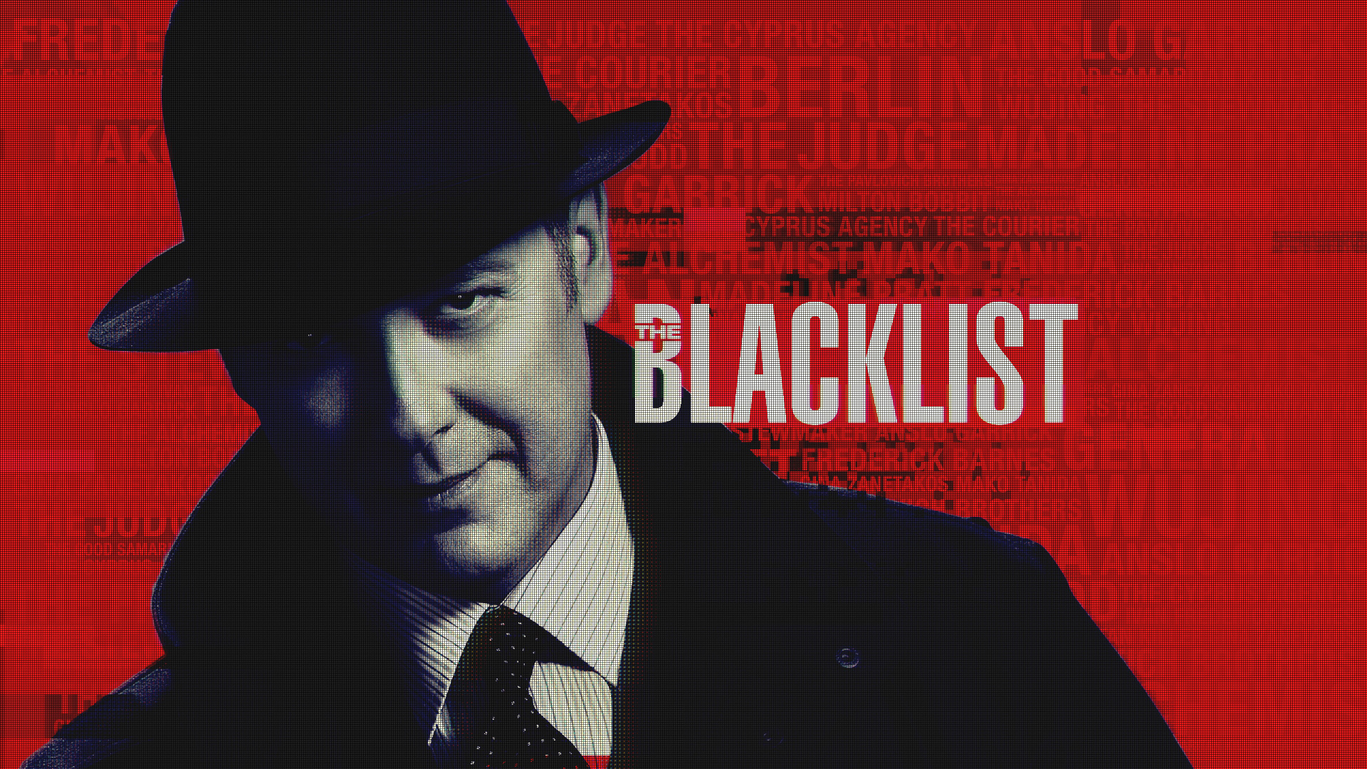
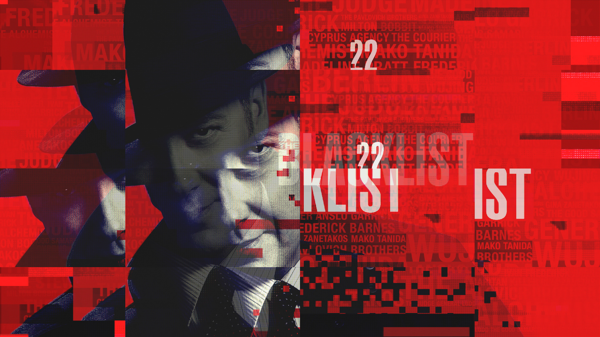
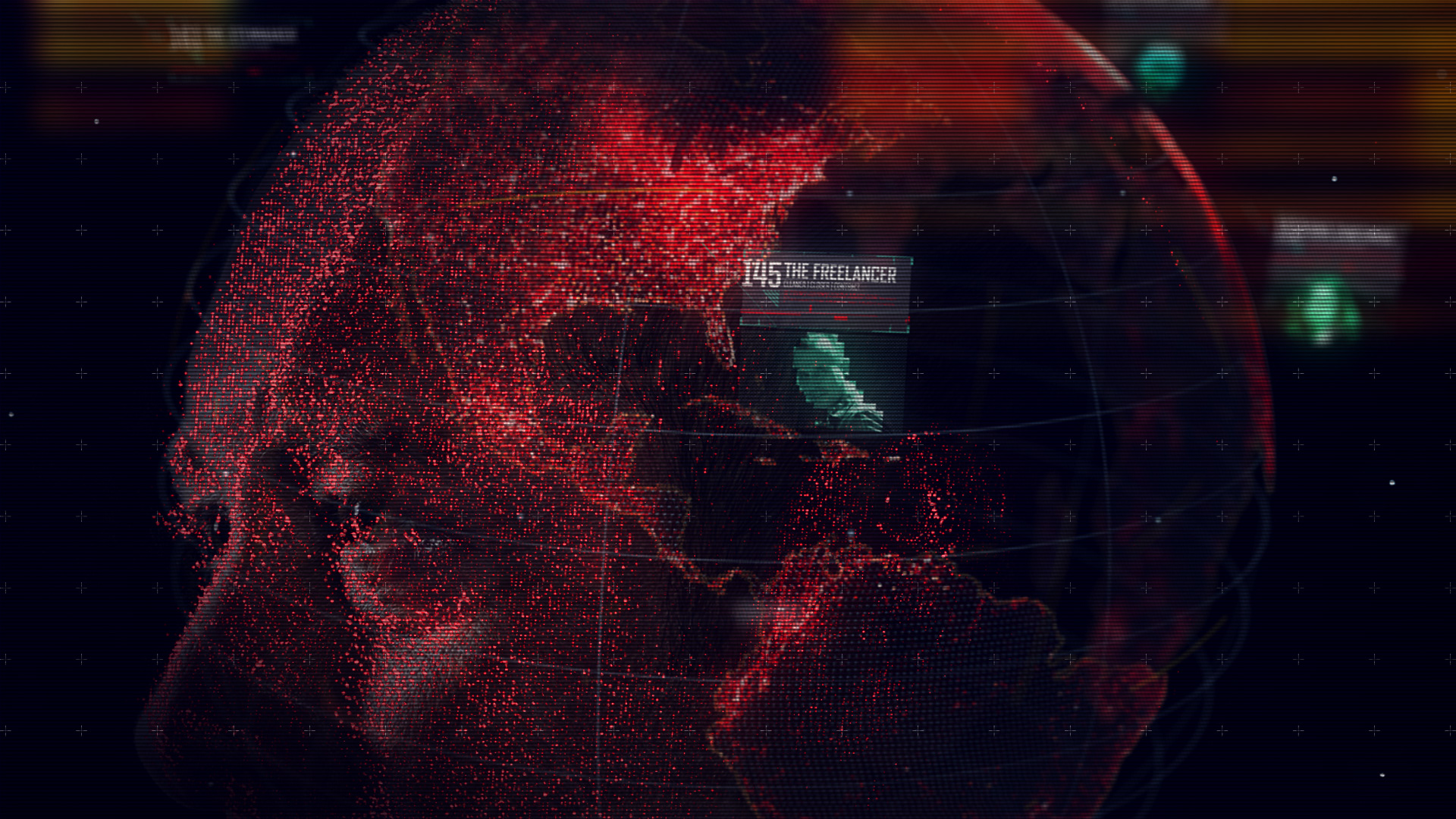
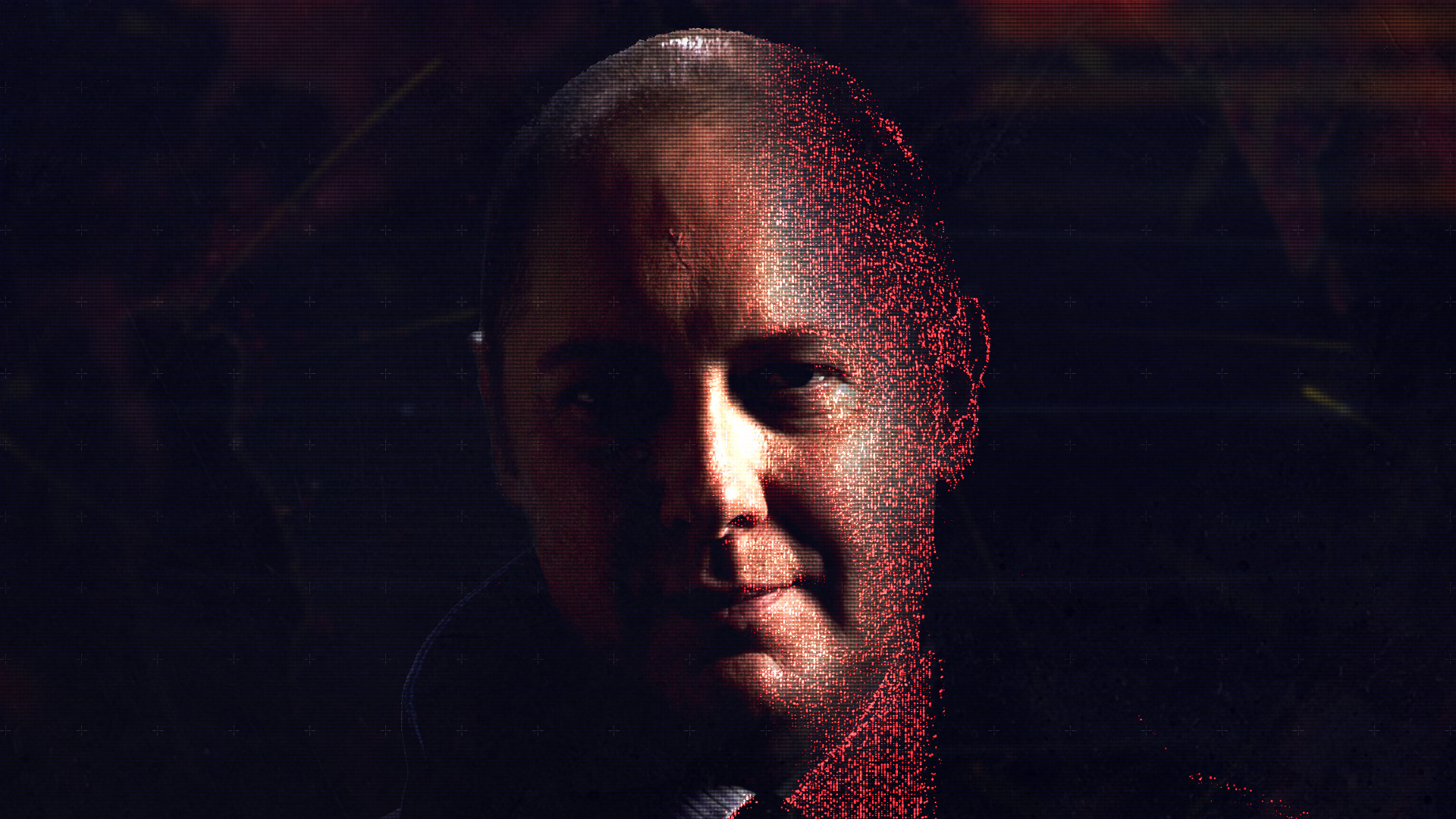
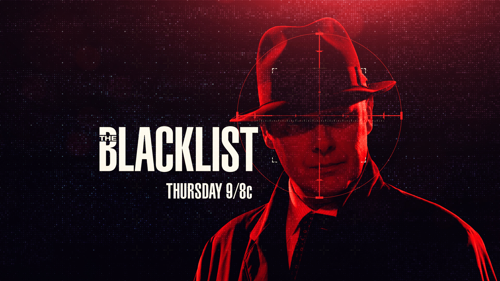
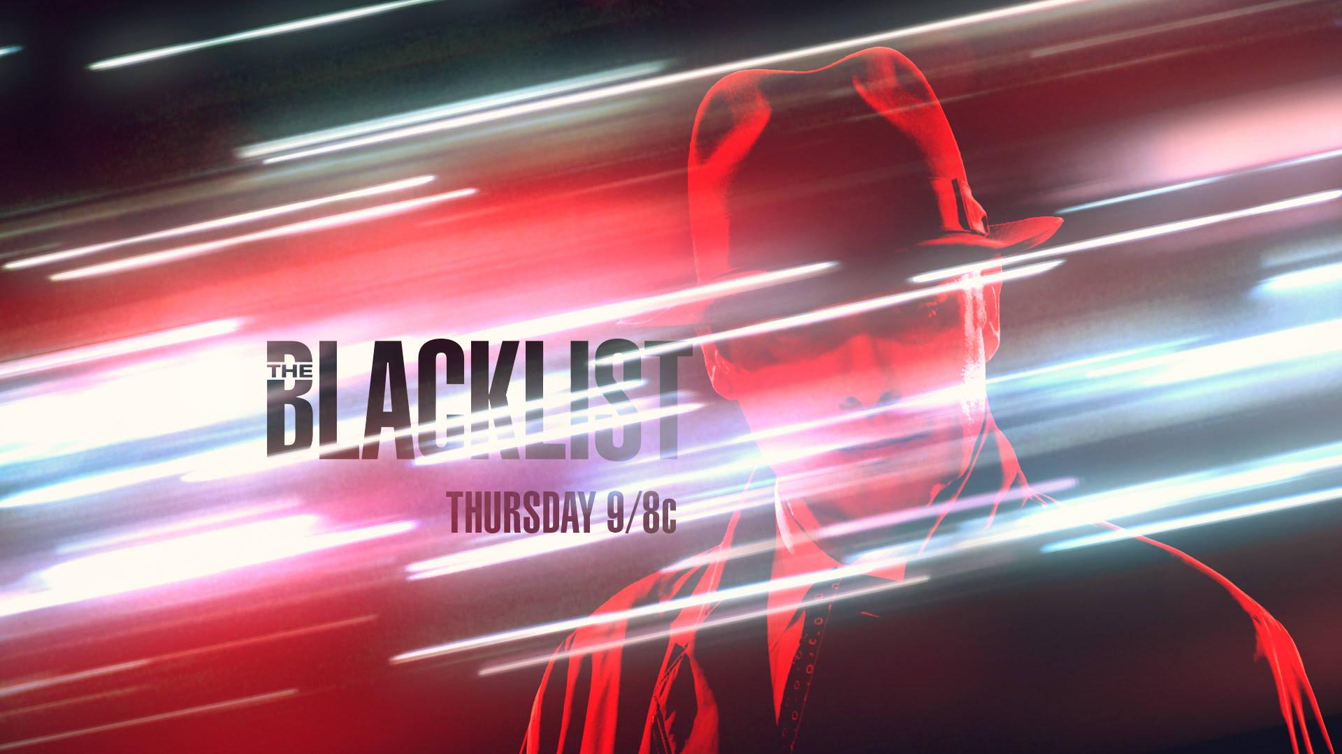
Season 2 | Concept Development & Design - "Glitch" Motif
Keeping in the same theme of the glitched fields of the security camera we saw in Season 1, the look was elevated to encompass more of the digital fragments and color separation aspects. The high-contrast imagery speaks to the tone of Season 2 with Red coming out strong and making a statement full of bravado.
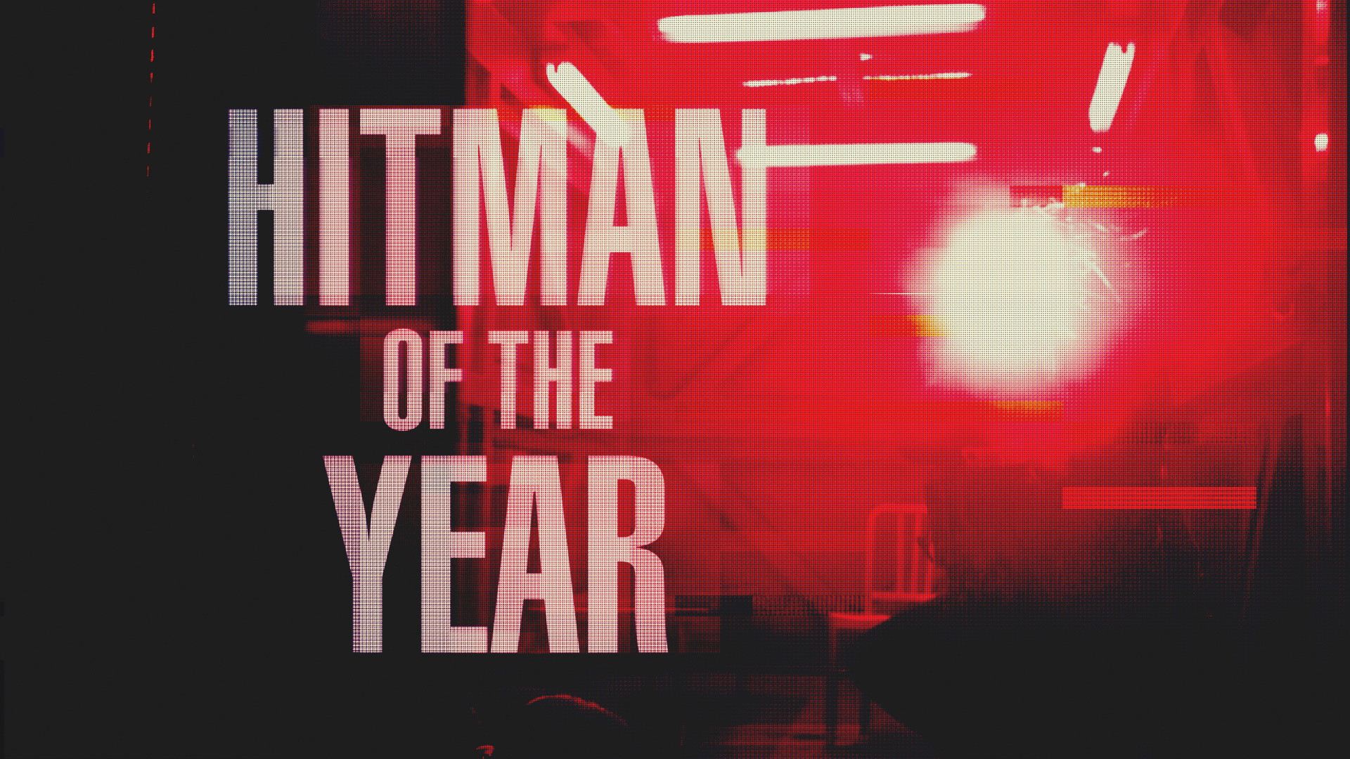
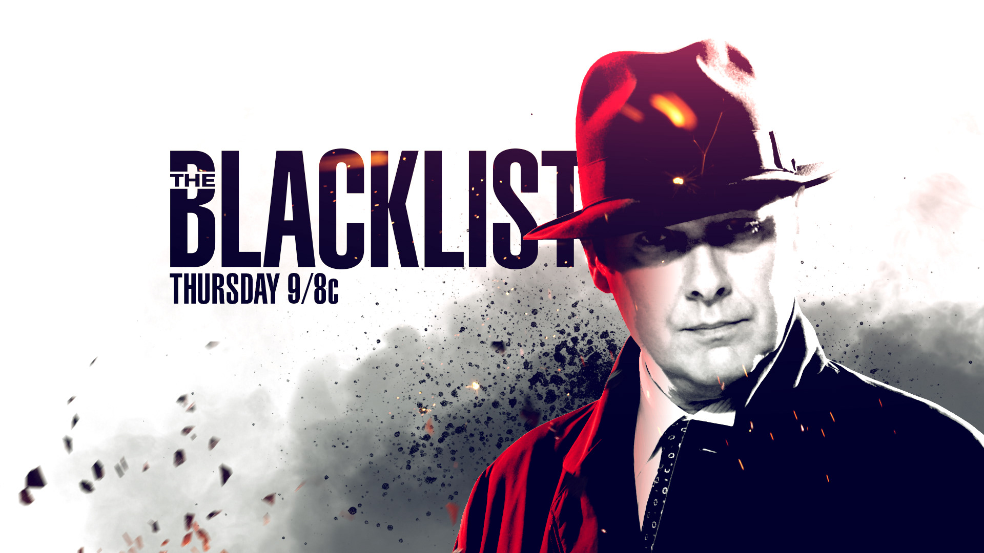
Season 2 | Design & Animation - End Tag
________________________________________________________________________________________
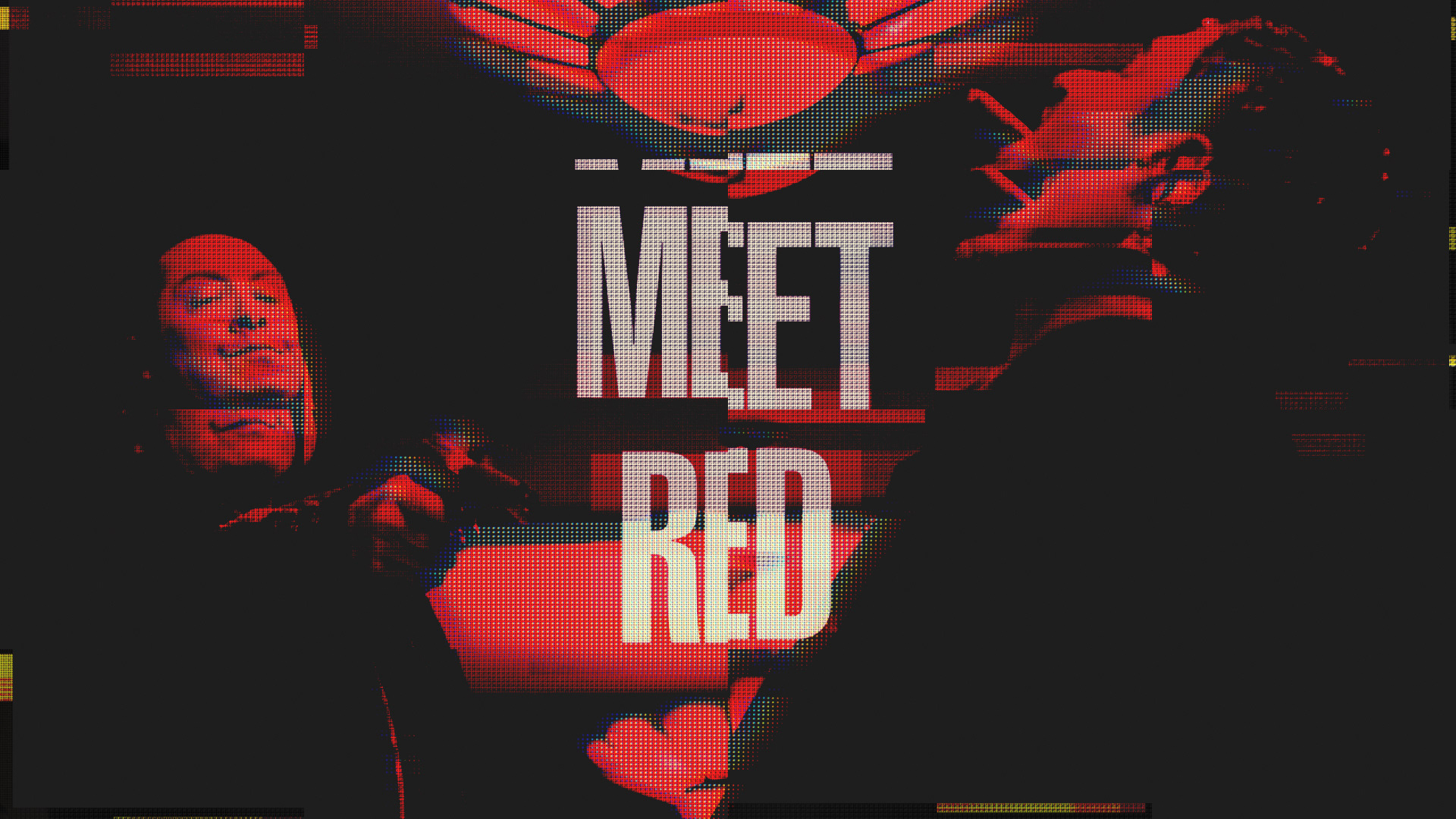
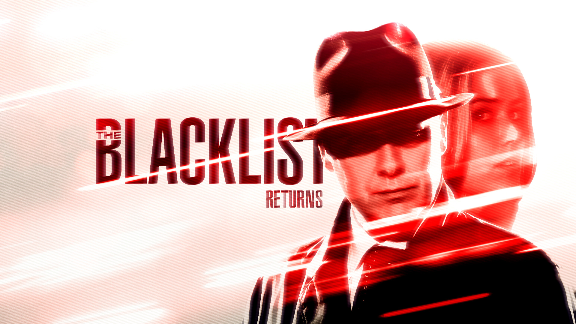
Season 3 | Concept Development & Design
On the run, Red & Liz became fugitives and the targets of the FBI and Blacklisters alike in Season 3. I developed multiple concepts based on key points from the season and the overarching theme of Red & Liz needing to find redemption.
"All In His Head"
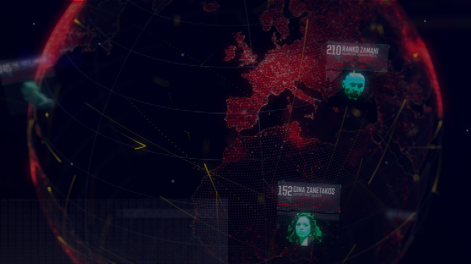
While the list of Blacklist names exists in Red's head, it is also the definition of his existence as the Blacklisters are a visual construct for Red.

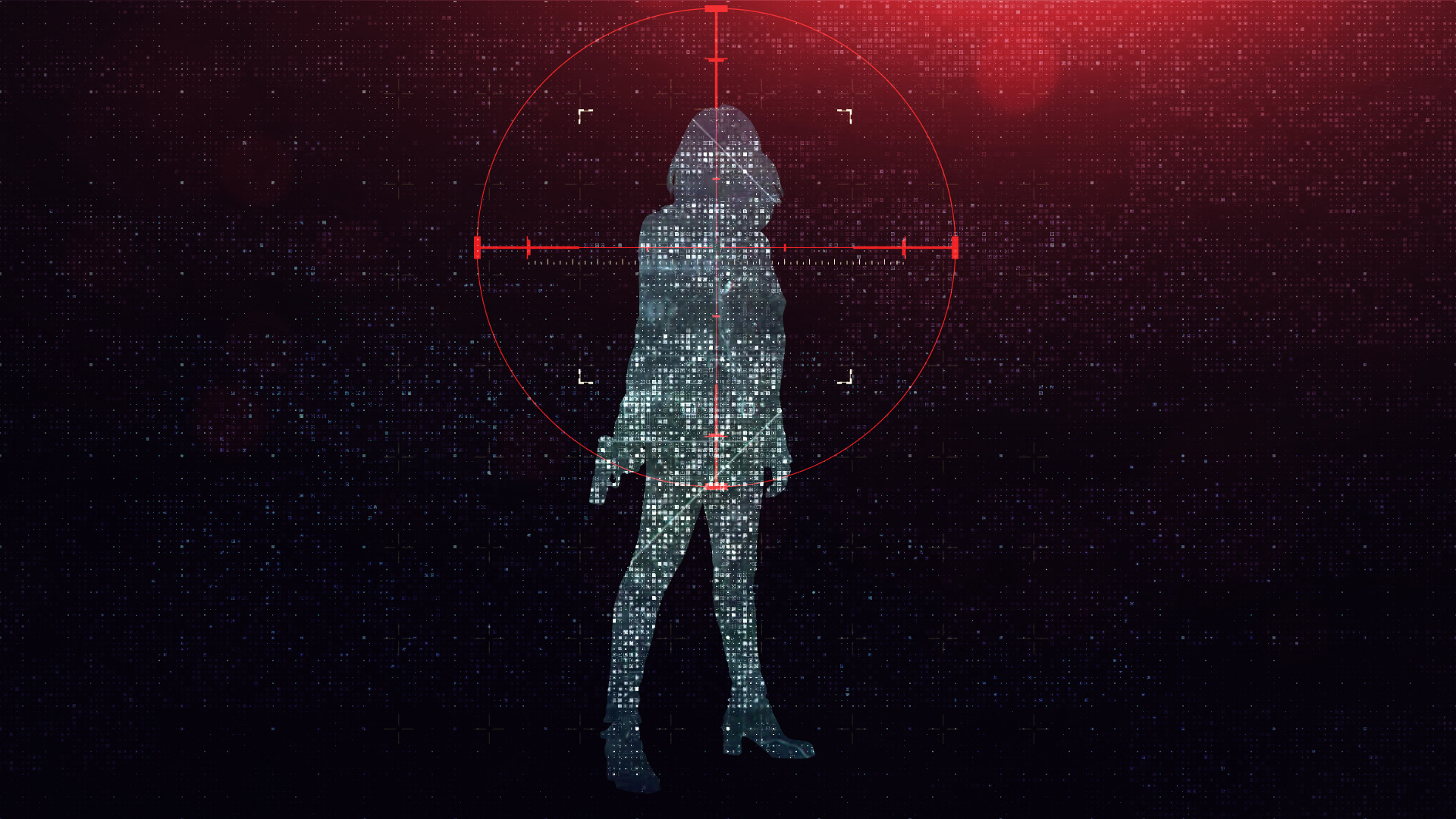
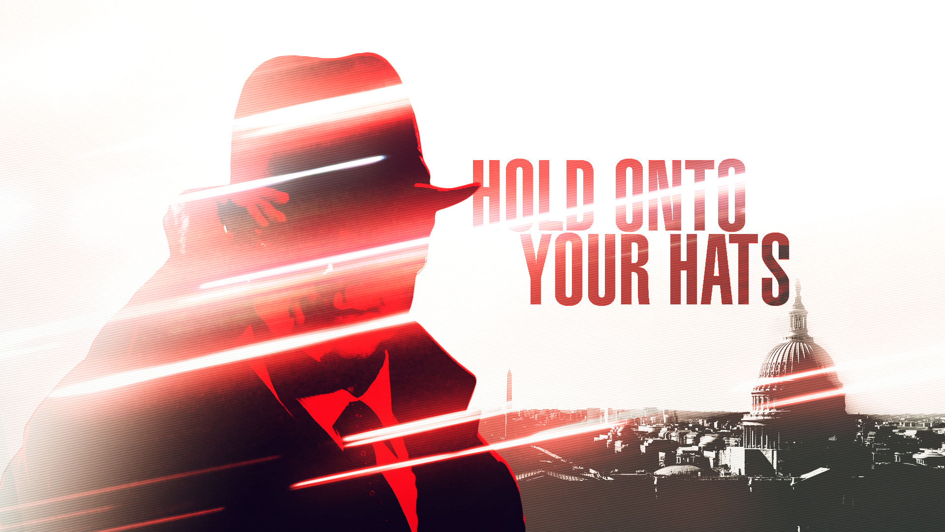
"Hard Target"
Maintaining the "glitch" motif, from the shadows as if parsing through data, Red & Liz arise with a target on their backs.

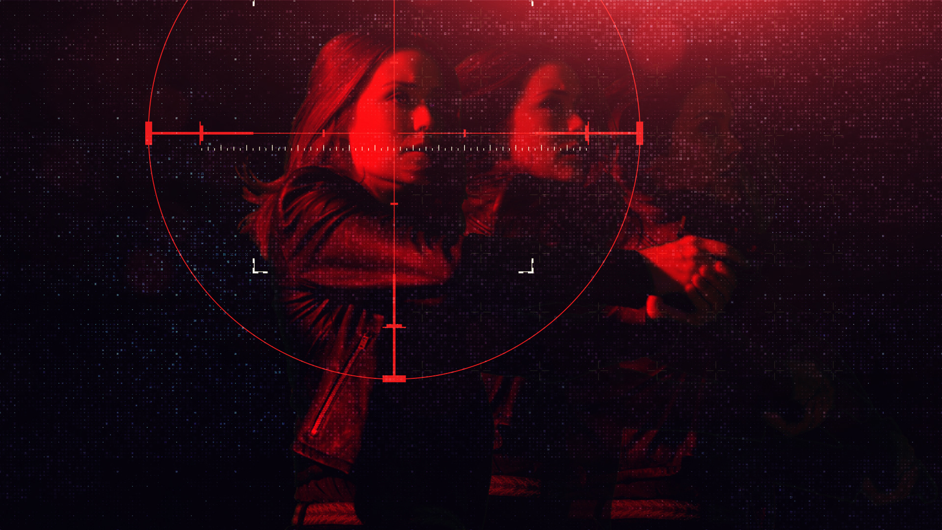
"Run"
Emphasizing the run as fugitives, the speed lines bring them into view and as quickly, wipe them out of sight.
"Path of Destruction"
Fleeing from one situation to the next, leaving a path of destruction in their wake.
________________________________________________________________________________________